
11·
9 hours agoIf you can’t engage with someone like an adult, don’t bother talking to them at all.
I’ll be here if you wish to further this without huffy remarks and silly playground insults.
If you can’t engage with someone like an adult, don’t bother talking to them at all.
I’ll be here if you wish to further this without huffy remarks and silly playground insults.
You are thinking of an entirely different thing.
I’m shocked the UK is as high as it is. Land costs a huge amount here, as does energy (highest in Europe).
Then again, the UK has an unusually large services sector after Thatcher basically decided to kill the manufacturing sector, and the UK is probably the IT leader in Europe, so I guess it has that going for it.
China being so ridiculously low has me questioning the data though…
*12 headlines, on a window that doesn’t even take up my whole screen, at 125% scaling, with a bookmark bar taking up space, and on a site rich with thumbnails.
And fine. I’ll set it to standard 100% scaling, at a size where I can still comfortably work:
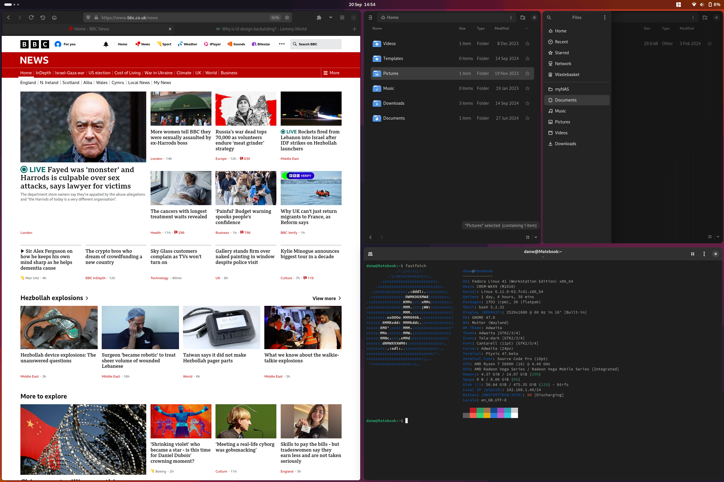
19 headlines, and some nice related thumbnails, a site header with plenty of links, 2 small file manager windows open, and a terminal window open.
None of this is even taking into consideration things in modern UX design like virtual desktops you can instantly switch between - something non-existent long ago.
Please do continue to tell me about how “unusable” laptops are.
The bulk of these aren’t issues with modern design, IMO, it’s about enshittification of the services we use.
Having huge spaces for ads, for example, isn’t a “this is how UX should be” thing, it’s a “lets shove ads everywhere to make money” thing. If you put the same amount of ads in older software/on sites that look like they’re from 2002, it would also look terrible.
The Windows start menu isn’t bad because it has some padding and easier click targets, it’s bad because the search doesn’t work, it’s full of ads, and pushes Bing searches on you.
Etc.
Damn I wish, I’ve been eyeing those up for ages.
It’s some Huawei laptop I found refurbished for a price I couldn’t turn down
Wow, you can fit one whole browser window on it … with headlines.
I easily fit my browser on it (displaying a reasonably-sized page without content being cut off) with a file manager at the side, which is what I had open at the time.
I don’t know what you wanted me to show you. 4 windows in a quadrant layout? That would be doable too, for most programs.
I was refuting your point that laptops are unusable because of modern UX - clearly they aren’t.
Even back in the CRT days, I could have a couple windows, such as email, text, and IDE
I thought we were talking about laptops! Now you’re talking about a monitor on a desk?
As I just showed you, you can have multiple windows open on a laptop. My laptop isn’t even large, it’s just a usual 14.something" laptop.
You should go into your display settings and turn your scaling down, because it seems to me you’ve got scaling set at 200% or something lol
How are laptop screens useless? I’m using a laptop right now. Doesn’t seem useless to me.

I have more than enough room.
Laptops wouldn’t be the main form factor for doing PC work if they were useless.
I need my 27” monitor to fit the useable workspace that a laptop screen once had
Unless you’ve got scaling set super high for some reason, that’s very doubtful.
This just means that functionality and interoperability criteria are more important than usability.
Sometimes yes. Usually no, for most people. If you make a word document in an older version of office, it’ll still work fine. If you use LibreOffice with the oldest-looking UI, it’ll still work. 99% of people don’t use the extremely niche features that have been added in recent years.
But people by and large don’t do that. They typically use the newest version.
This is the opposite of confirming your argument about UI\UX, because this means that UI\UX are order of magnitude less important in making the decision.
No it isn’t.
How is using software with modern interfaces actually a confirmation that people actually prefer older UX?
That’s simply because they “theme their system” to look as they wish and they don’t have to stop with Win98 or Win2K.
Exactly. And almost nobody themes their system to look like the supposedly superior in UI/UX Win95/98/2000. Indicating that maybe people don’t actually want a UI from that era, despite Reddit and Lemmy insisting that everybody does.
Ergonomics is not a matter of opinions, there’s plenty of research
Exactly. And that research has lead to where we are now.
Padding controls and indicators with space can be a good thing,
Is a good thing.
They’ve all heard something of it, but haven’t learned the actual thing.
No, they’ve generally improved it, and listened to actual UX usability studies.
Older UIs were usually (often, but not always) made with respect to ergonomics.
They almost never were. Seriously. Go back and try some 90s software. Most of it was a cluttered mess, ugly, really weirdly laid out, and had zero considering for anybody with disabilities.
Our ideas of all three things seem to be diametrically opposite. For me older UIs seem ordered, compact and correctly accented
And that’s fine. You can think differently. But most would disagree with you, outside the Redditor/Lemmy bubble.
The entire technology sector raises privacy concerns.
We really need a thorough and enforceable bill of rights when it comes to privacy.
I’ve never actually done it, because the only extension I use is Blur My Shell, and the dev is so quick at updating that extension that even when I immediately update to a beta release it’s already marked as compatible, but here it is:
gsettings set org.gnome.shell disable-extension-version-validation true
And if you want to revert back to normal and have extensions be validated again:
gsettings reset org.gnome.shell disable-extension-version-validation
I don’t know if there’s a GUI way to do it in one of the extension management platforms, I’ve never really looked
Gnome does not radically change their design all the time.
The last time they did that was Gnome 3, which came out 13 years ago.
And you may think it was change for the sake of change, but I’d disagree. The workflow is amazing. Using anything else just feels clunky to me now.
The changes made in Gnome were based on UX usability studies, not just changing shit for the sake of changing it.
You’re mistaking your dislike of Gnome not operating like a traditional windows-like UX for it being objectively bad.
Larger click targets for touch screen users
Larger screens with higher resolutions, meaning less need for cramped UIs
Larger click targets for trackpad users, as the PC market moved from desktops with relatively precise mouse inputs to small, imprecise trackpads that laptops had
Usability studies showing people generally like padding and spacing in their UX
You are among the first people I’ve seen online who hasn’t circlejerked about literally any level of padding/spacing being too much padding.
People on Reddit/Lemmy always talk about how unusably shit any modern design is, and how UX/UI from 20+ years ago was so much better.
Yet do they use ancient copies of the software that broadly still performs the tasks people need of them? No.
Do they theme their system to look like the oh-so-superior Win98? No.
Don’t get me wrong, sometimes I see a design change I dislike. But as a general rule, UI has definitely got better over the years.
And don’t get me wrong, part of me feels great nostalgia at seeing old UX’s, because it reminds me of the “good old days” when I bought my first computer in 1999. It’s fun to Go back and use systems from back then. And at first you think AAAAA this is so cool, I remember all this, this looks neat, but after that nostalgia wears off you think *“thank god modern UIs aren’t inconsistent, cramped and cluttered like this”
Nostalgia goggles are a powerful thing.
I don’t want what you’re smoking.
Ok, putting aside for a moment China’s totally honest and not at all fudged number of incarcerated people…
The US allowing prison labour is something I’m disgusted by.
But it’s still a far cry from abducting people based on their religion, sometimes sterilising them so they can’t have kids, threatening them with their life, threatening their family, and forcing them to work in factories or in construction, then using that slave labour to undercut and kill foreign competition.
Don’t try to twist this into a “you’re complaining about China therefore you think the US is great”. I’m saying China is far worse. Because they are, and only a complete muppet would think otherwise.
Maybe you’re ok with what China does (slavery and genocide), but I am not.
I don’t see what this has to do with the fact that China utilises slave labour from a religious minority group they are currently genociding to aid in their construction and manufacturing sector.
To my knowledge, you go to prison in the US when you commit a crime, as opposed to a labour camp where you are sterilised then made to build Fords under threat of death.
Yes it’s very different. Tesla certainly overworks their employees by basically expecting them to do overtime, and engages in anti-union shadiness, but that pales in comparison to utilising slave labour from a religious minority group they subjugate and have even been known to sterilise, as well as harm family members of those who aren’t behaving as the CCP wants them to.
Tesla still has to abide by US environmental regulations, which while not as strict as you’d find in Europe, are a hell of a lot stricter than China.
Tesla still has to follow construction and safety laws that, again while not super strict like in much of Europe, is a hell of a lot stricter than China.
The US also doesn’t subsidise exported Teslas in a move to exterminate foreign car companies before ramping up prices.
The 2nd. And even then, you can just turn off version checking and extensions generally just work.

Do you think that’s normal? I made very clear in my comment I was referring to the vast majority of people, not a tiny majority of 80s/early 90s software enthusiasts.
As above, do you think that’s normal? I never said *literally nobody, anywhere, on planet Earth does this.
Exactly. And that’s fine.
But the vast majority of people prefer UI now over what we had in the 90s.
In your opinion, sure. But that’s not the prevailing opinion.